
범주형 데이터 이진분류 경진대회
- 문제 유형 : 이진분류
- 평가지표 : ROC AUC
- 제출 시 사용한 모델 : 로지스틱 회귀
- 캐글노트북
# 본 문제 : https://www.kaggle.com/competitions/cat-in-the-dat
Categorical Feature Encoding Challenge | Kaggle
www.kaggle.com
# EDA : https://www.kaggle.com/code/jinkwonskk/eda-categorical-feature-encoding-challenge
[EDA]_Categorical Feature Encoding Challenge
Explore and run machine learning code with Kaggle Notebooks | Using data from Categorical Feature Encoding Challenge
www.kaggle.com
# 로지스틱 회귀 : https://www.kaggle.com/code/jinkwonskk/logistic1-categorical-feature-encoding-challenge
[logistic1]_Categorical Feature Encoding Challenge
Explore and run machine learning code with Kaggle Notebooks | Using data from Categorical Feature Encoding Challenge
www.kaggle.com
▣ 학습키워드
- 탐색적 데이터 분석 : 피처 요약표, 타깃값 분포, 이진/명목형/순서형/날짜 피처 분포
- 머신러닝 모델 : 로지스틱 회귀
- 피처 엔지니어링 : 원-핫 인코딩, 피처 맞춤 인코딩, 피처 스케일링
- 하이퍼파라미터 최적화 : 그리드서치
0. 탐색적 데이터 분석
1. 데이터 둘러보기
|
2. 데이터 시각화(타깃값 분포, 이진/명목형/순서형/날짜 피쳐 분포) |
3. 분석 처리 및 모델링 전략 |
import pandas as pd
# 데이터 경로
data_path = '/kaggle/input/cat-in-the-dat/'

train = pd.read_csv(data_path + 'train.csv', index_col='id')
test = pd.read_csv(data_path + 'test.csv', index_col='id')
submission = pd.read_csv(data_path + 'sample_submission.csv', index_col='id')
train.shape, test.shape
((300000, 24), (200000, 23))
train.head()
train.head().T
submission.head()
0.1 피처 요약표 만들기
- 피처요약표란?
피처를 한눈에 알아보기 좋은 표!
피처 타입이 무엇인지, 결측값은 없는지, 고유한 값은 몇개인지, 실제 어떤 값이 입력돼 있는지 알아볼 수 있다.
def resumetable(df):
    print(f'데이터 세트 형상: {df.shape}')
    summary = pd.DataFrame(df.dtypes, columns=['데이터 타입'])
    summary = summary.reset_index()
    summary = summary.rename(columns={'index': '피처'})
    summary['결측값 개수'] = df.isnull().sum().values
    summary['고윳값 개수'] = df.nunique().values
    summary['첫 번째 값'] = df.loc[0].values
    summary['두 번째 값'] = df.loc[1].values
    summary['세 번째 값'] = df.loc[2].values

    return summary

resumetable(train)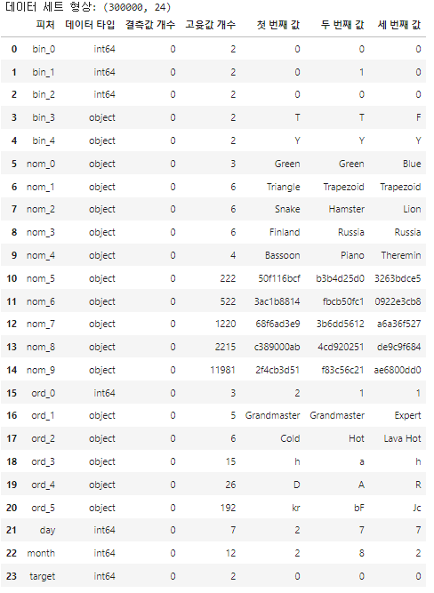
# 피처 요약표 해석하기
1. 이진피쳐 : bin_0~bin_4
- 문자는 숫자로 인코딩이 필요
2. 명목형 피처 : nom_0~nom_9
- 3개 이상은 명목형, 5~9는 고윳값이 많다.
3. 순서형 피처 : ord_0~ord_5
- 순서형 피처의 값들은 무엇으로 구성되어 있는지 확인하자
for i in range(3):
    feature = 'ord_' + str(i)
    print(f'{feature} 고윳값: {train[feature].unique()}')
ord_0 고윳값: [2 1 3]
ord_1 고윳값: ['Grandmaster' 'Expert' 'Novice' 'Contributor' 'Master']
ord_2 고윳값: ['Cold' 'Hot' 'Lava Hot' 'Boiling Hot' 'Freezing' 'Warm']for i in range(3, 6):
feature = 'ord_' + str(i)
print(f'{feature} 고윳값: {train[feature].unique()}')ord_3 고윳값: ['h' 'a' 'i' 'j' 'g' 'e' 'd' 'b' 'k' 'f' 'l' 'n' 'o' 'c' 'm']
ord_4 고윳값: ['D' 'A' 'R' 'E' 'P' 'K' 'V' 'Q' 'Z' 'L' 'F' 'T' 'U' 'S' 'Y' 'B' 'H' 'J'
'N' 'G' 'W' 'I' 'O' 'C' 'X' 'M']
ord_5 고윳값: ['kr' 'bF' 'Jc' 'kW' 'qP' 'PZ' 'wy' 'Ed' 'qo' 'CZ' 'qX' 'su' 'dP' 'aP'
'MV' 'oC' 'RL' 'fh' 'gJ' 'Hj' 'TR' 'CL' 'Sc' 'eQ' 'kC' 'qK' 'dh' 'gM'
'Jf' 'fO' 'Eg' 'KZ' 'Vx' 'Fo' 'sV' 'eb' 'YC' 'RG' 'Ye' 'qA' 'lL' 'Qh'
'Bd' 'be' 'hT' 'lF' 'nX' 'kK' 'av' 'uS' 'Jt' 'PA' 'Er' 'Qb' 'od' 'ut'
'Dx' 'Xi' 'on' 'Dc' 'sD' 'rZ' 'Uu' 'sn' 'yc' 'Gb' 'Kq' 'dQ' 'hp' 'kL'
'je' 'CU' 'Fd' 'PQ' 'Bn' 'ex' 'hh' 'ac' 'rp' 'dE' 'oG' 'oK' 'cp' 'mm'
'vK' 'ek' 'dO' 'XI' 'CM' 'Vf' 'aO' 'qv' 'jp' 'Zq' 'Qo' 'DN' 'TZ' 'ke'
'cG' 'tP' 'ud' 'tv' 'aM' 'xy' 'lx' 'To' 'uy' 'ZS' 'vy' 'ZR' 'AP' 'GJ'
'Wv' 'ri' 'qw' 'Xh' 'FI' 'nh' 'KR' 'dB' 'BE' 'Bb' 'mc' 'MC' 'tM' 'NV'
'ih' 'IK' 'Ob' 'RP' 'dN' 'us' 'dZ' 'yN' 'Nf' 'QM' 'jV' 'sY' 'wu' 'SB'
'UO' 'Mx' 'JX' 'Ry' 'Uk' 'uJ' 'LE' 'ps' 'kE' 'MO' 'kw' 'yY' 'zU' 'bJ'
'Kf' 'ck' 'mb' 'Os' 'Ps' 'Ml' 'Ai' 'Wc' 'GD' 'll' 'aF' 'iT' 'cA' 'WE'
'Gx' 'Nk' 'OR' 'Rm' 'BA' 'eG' 'cW' 'jS' 'DH' 'hL' 'Mf' 'Yb' 'Aj' 'oH'
'Zc' 'qJ' 'eg' 'xP' 'vq' 'Id' 'pa' 'ux' 'kU' 'Cl']
4. 그 외 피처 : day, month, target
print('day 고윳값:', train['day'].unique())
print('month 고윳값:', train['month'].unique())
print('target 고윳값:', train['target'].unique())
day 고윳값: [2 7 5 4 3 1 6]
month 고윳값: [ 2 8 1 4 10 3 7 9 12 11 5 6]
target 고윳값: [0 1]
1. 데이터 시각화
import seaborn as sns
import matplotlib as mpl
import matplotlib.pyplot as plt
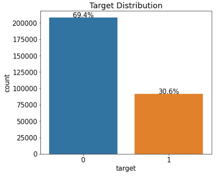
%matplotlib inline1.1 타깃 값 분포
mpl.rc('font', size=15) # 폰트 크기 설정
plt.figure(figsize=(7, 6)) # Figure 크기 설정

# 타깃값 분포 카운트플롯
ax = sns.countplot(x='target', data=train)
ax.set(title='Target Distribution');
타깃값 분포를 알아야 데이터가 얼마나 불균형한지 파악하기 쉽다.
타깃값 분포가 너무 치우쳐져 있으면 데이터를 조정해주기도 한다.
* 보통은 양성이 음성에 비해 개수가 적다.
TIP!
수치형 데이터의 분포를 파악할 땐 주로 distplot() / 선형
범주형 데이터의 분포를 파악할 땐 주로 countplot() / 박스형
rectangle = ax.patches[0] # 첫 번째 Rectangle 객체
print('사각형 높이:', rectangle.get_height())
print('사각형 너비:', rectangle.get_width())
print('사각형 왼쪽 테두리의 x축 위치:', rectangle.get_x())
* ax.patches : 'ax축을 구성하는 그래프 동형 객체 모두를 담은 리스트 / patch : 조각이라는 의미
사각형 높이: 208236
사각형 너비: 0.8
사각형 왼쪽 테두리의 x축 위치: -0.4
print('텍스트 위치의 x좌표:', rectangle.get_x() + rectangle.get_width()/2.0)
print('텍스트 위치의 y좌표:', rectangle.get_height() + len(train)*0.001)
텍스트 위치의 x좌표: 0.0
텍스트 위치의 y좌표: 208536.0def write_percent(ax, total_size):
'''도형 객체를 순회하며 막대 상단에 타깃값 비율 표시'''
for patch in ax.patches:
height = patch.get_height() # 도형 높이(데이터 개수)
width = patch.get_width() # 도형 너비
left_coord = patch.get_x() # 도형 왼쪽 테두리의 x축 위치
percent = height/total_size*100 # 타깃값 비율
# (x, y) 좌표에 텍스트 입력
ax.text(x=left_coord + width/2.0, # x축 위치
y=height + total_size*0.001, # y축 위치
s=f'{percent:1.1f}%', # 입력 텍스트
ha='center') # 가운데 정렬
plt.figure(figsize=(7, 6))
ax = sns.countplot(x='target', data=train)
write_percent(ax, len(train)) # 비율 표시
ax.set_title('Target Distribution');
1.2 이진 피처 분포
import matplotlib.gridspec as gridspec # 여러 그래프를 격자 형태로 배치

# 3행 2열 틀(Figure) 준비
mpl.rc('font', size=12)
grid = gridspec.GridSpec(3, 2) # 그래프(서브플롯)를 3행 2열로 배치
plt.figure(figsize=(10, 16))   # 전체 Figure 크기 설정
plt.subplots_adjust(wspace=0.4, hspace=0.3) # 서브플롯 간 좌우/상하 여백 설정

# 서브플롯 그리기
bin_features = ['bin_0', 'bin_1', 'bin_2', 'bin_3', 'bin_4'] # 피처 목록

for idx, feature in enumerate(bin_features):
    ax = plt.subplot(grid[idx])

    # ax축에 타깃값 분포 카운트플롯 그리기
    sns.countplot(x=feature,
                  data=train,
                  hue='target',
                  palette='pastel', # 그래프 색상 설정
                  ax=ax)

    ax.set_title(f'{feature} Distribution by Target') # 그래프 제목 설정
    write_percent(ax, len(train))                     # 비율 표시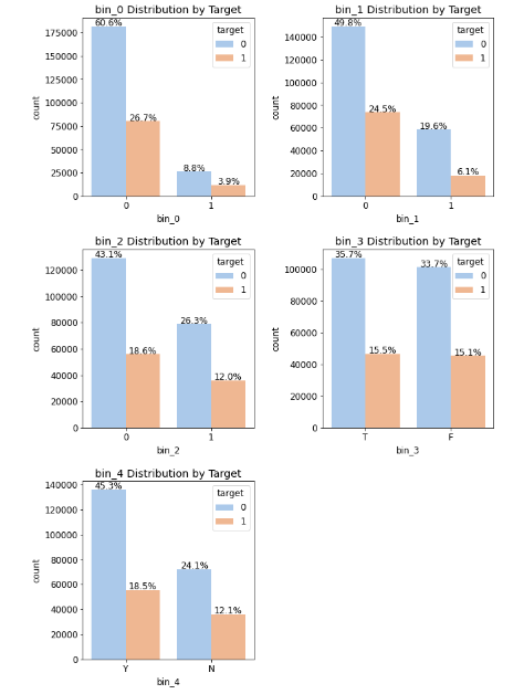
1.3 명목형 피처 분포
pd.crosstab(train['nom_0'], train['target'])스텝 1 : 교차분석표 생성 함수 만들기
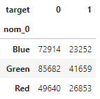
# 정규화 후 비율을 백분율로 표현
crosstab = pd.crosstab(train['nom_0'], train['target'], normalize='index')*100
crosstab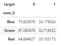
crosstab = crosstab.reset_index() # 인덱스 재설정
crosstab
def get_crosstab(df, feature):
    crosstab = pd.crosstab(df[feature], df['target'], normalize='index')*100
    crosstab = crosstab.reset_index()
    return crosstab
함수에 데이터와 원하는 피처를 넣으면 알아서 그 피처의 분포율을 백분율로 보여준다.
crosstab = get_crosstab(train, 'nom_0')
crosstab
crosstab[1]0 24.179024
1 32.714522
2 35.105173
Name: 1, dtype: float64스텝 2 : 포인트플롯 생성 함수 만들기
- ax: 포인트플롯을 그릴 축
- feature : 포인트플롯으로 그릴 피처
- crosstab : 교차분석표
def plot_pointplot(ax, feature, crosstab):
    ax2 = ax.twinx() # x축은 공유하고 y축은 공유하지 않는 새로운 축 생성
    # 새로운 축에 포인트플롯 그리기
    ax2 = sns.pointplot(x=feature, y=1, data=crosstab,
                        order=crosstab[feature].values, # 포인트플롯 순서
                        color='black',                  # 포인트플롯 색상
                        legend=False)                   # 범례 미표시
    ax2.set_ylim(crosstab[1].min()-5, crosstab[1].max()*1.1) # y축 범위 설정
    ax2.set_ylabel('Target 1 Ratio(%)')
- 축 하나에 서로 다른 그래프를 그리려면 X축을 공유해야 한다. / ax.twinx()로 x축을 공유
스텝 3 : 피처 분포도 및 피처별 타깃값 1의 비율 포인트플롯 생성 함수 만들기
def plot_cat_dist_with_true_ratio(df, features, num_rows, num_cols,
                                  size=(15, 20)):
    plt.figure(figsize=size)  # 전체 Figure 크기 설정
    grid = gridspec.GridSpec(num_rows, num_cols) # 서브플롯 배치
    plt.subplots_adjust(wspace=0.45, hspace=0.3) # 서브플롯 좌우/상하 여백 설정

    for idx, feature in enumerate(features):
        ax = plt.subplot(grid[idx])
        crosstab = get_crosstab(df, feature) # 교차분석표 생성

        # ax축에 타깃값 분포 카운트플롯 그리기
        sns.countplot(x=feature, data=df,
                      order=crosstab[feature].values,
                      color='skyblue',
                      ax=ax)

        write_percent(ax, len(df)) # 비율 표시

        plot_pointplot(ax, feature, crosstab) # 포인트플롯 그리기

        ax.set_title(f'{feature} Distribution') # 그래프 제목 설정
nom_features = ['nom_0', 'nom_1', 'nom_2', 'nom_3', 'nom_4'] # 명목형 피처
plot_cat_dist_with_true_ratio(train, nom_features, num_rows=3, num_cols=2)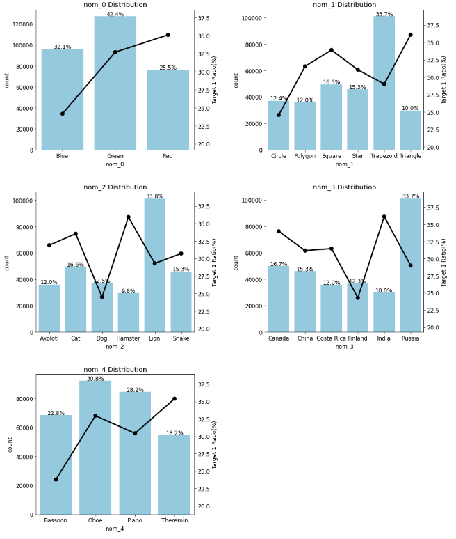
1.4 순서형 피처 분포
ord_features = ['ord_0', 'ord_1', 'ord_2', 'ord_3'] # 순서형 피처
plot_cat_dist_with_true_ratio(train, ord_features,
                              num_rows=2, num_cols=2, size=(15, 12))
* 고윳값 순서에 따라 타깃값이 1인 비율이 증가한다.
from pandas.api.types import CategoricalDtype

ord_1_value = ['Novice', 'Contributor', 'Expert', 'Master', 'Grandmaster']
ord_2_value = ['Freezing', 'Cold', 'Warm', 'Hot', 'Boiling Hot', 'Lava Hot']

# 순서를 지정한 범주형 데이터 타입
ord_1_dtype = CategoricalDtype(categories=ord_1_value, ordered=True)
ord_2_dtype = CategoricalDtype(categories=ord_2_value, ordered=True)

# 데이터 타입 변경
train['ord_1'] = train['ord_1'].astype(ord_1_dtype)
train['ord_2'] = train['ord_2'].astype(ord_2_dtype)
plot_cat_dist_with_true_ratio(train, ord_features,
                              num_rows=2, num_cols=2, size=(15, 12))
plot_cat_dist_with_true_ratio(train, ['ord_4', 'ord_5'],
                              num_rows=2, num_cols=1, size=(15, 12))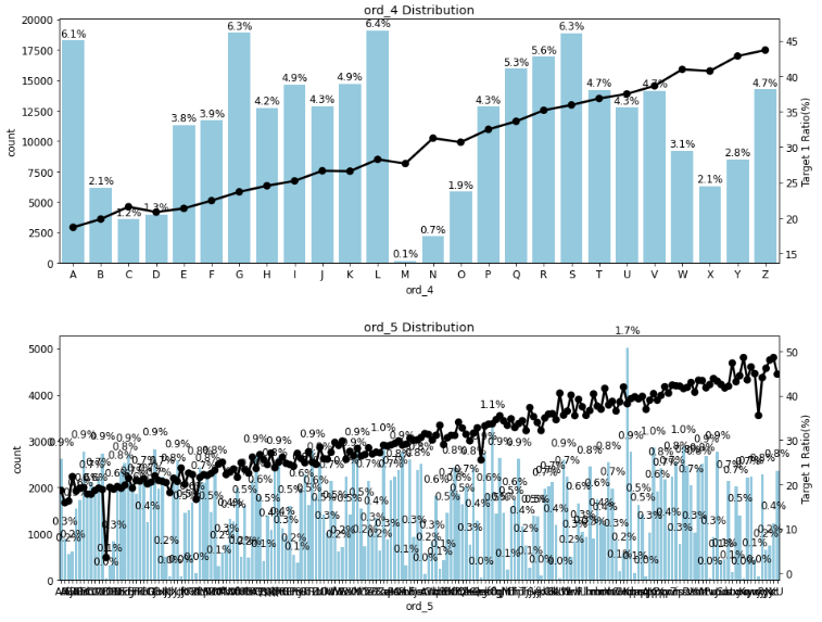
1.5 날짜 피처 분포
date_features = ['day', 'month']
plot_cat_dist_with_true_ratio(train, date_features,
                              num_rows=2, num_cols=1, size=(10, 10))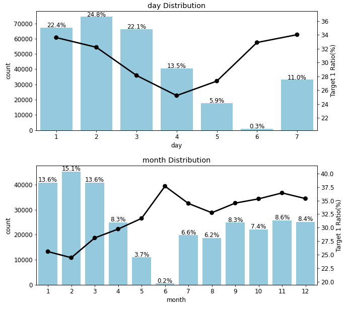
분석정리
1. 결측값은 없다.
2. 제거할 피쳐는 없었다.
2. 피처 엔지니어링 I : 피처 맞춤 인코딩
all_data['bin_3'] = all_data['bin_3'].map({'F':0, 'T':1})
all_data['bin_4'] = all_data['bin_4'].map({'N':0, 'Y':1})
데이터 합치기
# 훈련 데이터와 테스트 데이터 합치기
all_data = pd.concat([train, test])
all_data = all_data.drop('target', axis=1) # 타깃값 제거
이진 피처 인코딩
all_data['bin_3'] = all_data['bin_3'].map({'F':0, 'T':1})
all_data['bin_4'] = all_data['bin_4'].map({'N':0, 'Y':1})
순서형 피처 인코딩
ord1dict = {'Novice':0, 'Contributor':1,
            'Expert':2, 'Master':3, 'Grandmaster':4}
ord2dict = {'Freezing':0, 'Cold':1, 'Warm':2,
            'Hot':3, 'Boiling Hot':4, 'Lava Hot':5}

all_data['ord_1'] = all_data['ord_1'].map(ord1dict)
all_data['ord_2'] = all_data['ord_2'].map(ord2dict)
map함수를 적용할 딕셔너리를 만들때 꼭 순서에 주의하자
from sklearn.preprocessing import OrdinalEncoder

ord_345 = ['ord_3', 'ord_4', 'ord_5']

ord_encoder = OrdinalEncoder() # OrdinalEncoder 객체 생성
# ordinal 인코딩 적용
all_data[ord_345] = ord_encoder.fit_transform(all_data[ord_345])

# 피처별 인코딩 순서 출력
for feature, categories in zip(ord_345, ord_encoder.categories_):
    print(feature)
    print(categories)
문자값들이 자동으로 숫자로 변동
a => 0.0
D => 3
......
명목형 피처 인코딩
nom_features = ['nom_' + str(i) for i in range(10)] # 명목형 피처from sklearn.preprocessing import OneHotEncoder
onehot_encoder = OneHotEncoder() # OneHotEncoder 객체 생성
# 원-핫 인코딩 적용
encoded_nom_matrix = onehot_encoder.fit_transform(all_data[nom_features])
encoded_nom_matrix원핫인코딩한 값(encoded_nom_matrix)를 바로 값에 할당시켜주지 않는다!!
나중에 해당 피처를 저장해준다. / 이유는 희소행렬 때문에
all_data = all_data.drop(nom_features, axis=1) # 기존 명목형 피처 삭제날짜 피처 인코딩
date_features  = ['day', 'month'] # 날짜 피처

# 원-핫 인코딩 적용
encoded_date_matrix = onehot_encoder.fit_transform(all_data[date_features])

all_data = all_data.drop(date_features, axis=1) # 기존 날짜 피처 삭제

encoded_date_matrix
날짜 피쳐도 나중에 값을 합쳐준다.
2. 피처 엔지니어링 II : 피처 스케일링
순서형 피처 스케일링
from sklearn.preprocessing import MinMaxScaler

ord_features = ['ord_' + str(i) for i in range(6)] # 순서형 피처
# min-max 정규화
all_data[ord_features] = MinMaxScaler().fit_transform(all_data[ord_features])
min-max 정규화는 값을 0~1사이로 바꿔준다. / 정규화는 바로 적용
0,1,2,3,4,... → 0, 0.2, 0.4.....
인코딩 및 스케일링된 피처 합치기
from scipy import sparse

# 인코딩 및 스케일링된 피처 합치기
all_data_sprs = sparse.hstack([sparse.csr_matrix(all_data),
                               encoded_nom_matrix,
                               encoded_date_matrix],
                              format='csr')
앞에서 만들었던 데이터들을 여기서 합쳐준다. CSR 형석으로!
num_train = len(train) # 훈련 데이터 개수

# 훈련 데이터와 테스트 데이터 나누기
X_train = all_data_sprs[:num_train] # 0 ~ num_train - 1행
X_test = all_data_sprs[num_train:] # num_train ~ 마지막 행

y = train['target']
from sklearn.model_selection import train_test_split
# 훈련 데이터, 검증 데이터 분리
X_train, X_valid, y_train, y_valid = train_test_split(X_train, y,
test_size=0.1,
stratify=y,
random_state=10)3. 하이퍼 파라미터 최적화
%%time

from sklearn.model_selection import GridSearchCV
from sklearn.linear_model import LogisticRegression

# 로지스틱 회귀 모델 생성
logistic_model = LogisticRegression()

# 하이퍼파라미터 값 목록
lr_params = {'C':[0.1, 0.125, 0.2], 'max_iter':[800, 900, 1000],
             'solver':['liblinear'], 'random_state':[42]}

# 그리드서치 객체 생성
gridsearch_logistic_model = GridSearchCV(estimator=logistic_model,
                                         param_grid=lr_params,
                                         scoring='roc_auc', # 평가지표
                                         cv=5)
# 그리드서치 수행
gridsearch_logistic_model.fit(X_train, y_train)

print('최적 하이퍼파라미터:', gridsearch_logistic_model.best_params_)
3.1 모델 성능 검증
y_valid_preds = gridsearch_logistic_model.predict_proba(X_valid)[:, 1]from sklearn.metrics import roc_auc_score # ROC AUC 점수 계산 함수
# 검증 데이터 ROC AUC
roc_auc = roc_auc_score(y_valid, y_valid_preds)
print(f'검증 데이터 ROC AUC : {roc_auc:.4f}')3.2 예측 및 결과 제출
# 타깃값 1일 확률 예측
y_preds = gridsearch_logistic_model.best_estimator_.predict_proba(X_test)[:,1]

# 제출 파일 생성
submission['target'] = y_preds
submission.to_csv('submission.csv')
# 알게된점 :
1. 피처 분포도 및 피처별 타깃값 1의 비율(카운트플롯, 포인트플롯)로 데이터 분석하기
- 두개의 표를 만들기 위해 X축 새로 만들기(twin.ax)